When the spring collections arrive, colour fills the shops of illa Carlemany. This winter, alongside the ever-present black, dark blue and grey, we’ve also seen white, off white, burgundy, bottle green and camel in windows and on mannequins. Yet it’s during the spring, which is just about to begin, when colour takes centre stage. And if we look at the catwalks, the major fashion designers are going way beyond the always comfortable, perfect, classic and elegant neutral colour combinations.
With the unexpected onset of the pandemic, the fashion brands opted for minimalism ¾simple, loose shapes and neutral tones— and now, two years later, bright, bold and lively colours form the palette of a fashion that is putting everything on the line to find joy through colour. It’s time to stop associating specific colours with specific times of the year ¾as occurs with red, which is highly influenced by Christmas and New Year’s Eve¾ and stop viewing certain combinations as impossible ¾like mixing green and squash orange. After all, choosing and combining colours is the antidote to boredom, sadness and humdrum uniformity.
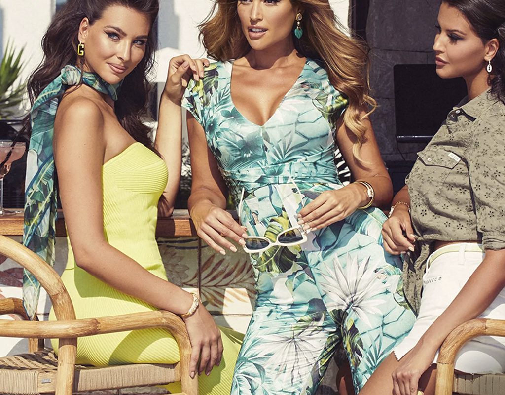
Vitamin C orange, French blue, fire red, bubble-gum pink, Pantone’s purple colour of the year, mint green and bright yellow are this season’s reigning hues, with a few variations and related ideas.
Yet beyond the colours themselves, the combinations are also a defining feature of this season, with seemingly impossible proposals that defy the conventional cannons of matching colour schemes, whether among the different garment pieces or alongside their accessories. Loud, lively and cheerful combinations that convey happiness and joie de vivre.